Uncommon Descent Serving The Intelligent Design Community

How to Distort Data With Charts 101

Share
Facebook
Twitter
LinkedIn
Flipboard
Print
Email

We’ve all heard the old saw about lies, damn lies and statistics.  It seems the aphorism holds when the statistics are charted.  Here is the only chart you will ever need when discussing global warming:

untitled

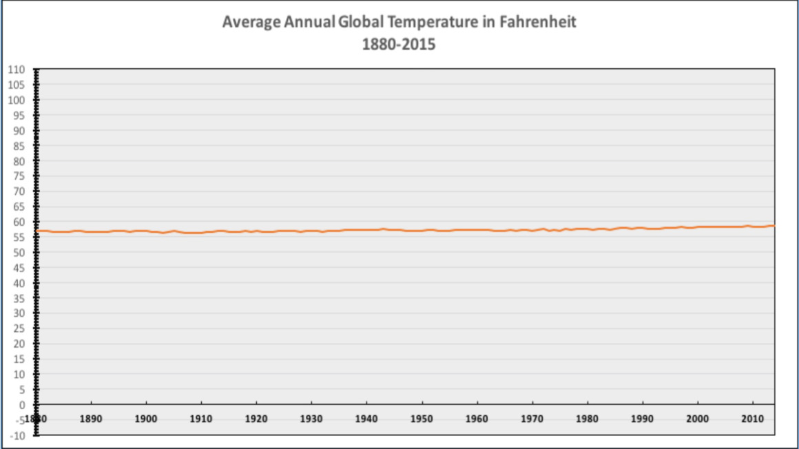
See here for an explanation.

Comments
Some decades ago in a source I can't recall I read that 85 degrees F is the perfect temperature for a naked human to relax in the shade. And of course that was before air conditioning. The general problem is that the Warmists are guys who simply build computer models for the purpose of justifying new funding to "improve" their computer models. The fact that their models cannot "post-dict" (recreate) the historic spike in temperatures in the 1930s (the warmest period on record) is considered irrelevant by both the modelers and the government idiots giving them fresh money. Real live meteorologists and climatologists recognize that there have been HUGE shifts in regional temperatures over the last 10,000 years, and that nothing interesting has happened in the last 100 years or so.mahuna
October 22, 2015
October
10
Oct
22
22
2015
02:34 PM
2
02
34
PM
PDT
"Why use temperature anomalies" I already know why they use anomalies: because it allows them to customize for the answer they want. Andrewasauber
October 22, 2015
October
10
Oct
22
22
2015
08:33 AM
8
08
33
AM
PDT
REC- You failed to find a mistake in the mathematics. The links provided must be over your head.Virgil Cain
October 22, 2015
October
10
Oct
22
22
2015
08:17 AM
8
08
17
AM
PDT
It figures that the climate alarmists would ignore the mathematics that refutes their claims. Why care about facts when you can incite mob mentality, eh, alarmists?Virgil Cain
October 22, 2015
October
10
Oct
22
22
2015
08:16 AM
8
08
16
AM
PDT
Virgil @ 19, where are you getting the 0.6C number? The links you provide go to some of the dumbest curve fitting I've ever seen, but even that denialist seems to come up with larger numbers.REC
October 22, 2015
October
10
Oct
22
22
2015
08:15 AM
8
08
15
AM
PDT
asauber: That’s because it’s a calculation "Why use temperature anomalies (departure from average) and not absolute temperature measurements?" https://www.ncdc.noaa.gov/monitoring-references/faq/anomalies.phpZachriel
October 22, 2015
October
10
Oct
22
22
2015
07:50 AM
7
07
50
AM
PDT
Why zoom in and remove context? To say that a chart is "zoomed in" or "zoomed out" presumes that there's an appropriate level of zoom. I think that level is one that makes trends perceptible and doesn't distort the data or make them unnecessarily difficult to interpret. If you think a particular chart is unnecessarily "zoomed in," I'd be interested in the details. As for this chart, all the vast empty space is meaningless. They chose the top and bottom portions of the range by selecting the highest and lowest individual observed temperatures, IIRC. But those values aren't useful--the actual data being charted don't come even close to either end, because they're mean temps rather than individual temps. In other words, the vast empty space--and it's not just the majority of the y-axis, but a huge majority of the y-axis--isn't there to illustrate anything. We don't expect mean temps to rise to the highest or lowest individual temps, by definition. It's there to make the data harder to understand. A great illustration of "how to distort data with charts."Learned Hand
October 22, 2015
October
10
Oct
22
22
2015
07:47 AM
7
07
47
AM
PDT
Most researchers agree that warming of 2-4°C will be detrimental to the ecosystem, and disruptive to humans.
Then it is a good thing that a doubling of CO2, from 280 ppm to 560 ppm, would only cause an increase of 0.6 C.Virgil Cain
October 22, 2015
October
10
Oct
22
22
2015
07:43 AM
7
07
43
AM
PDT
"mean temperature is very difficult to measure" That's because it's a calculation, dimwit. Andrewasauber
October 22, 2015
October
10
Oct
22
22
2015
07:24 AM
7
07
24
AM
PDT
hrun0815: You should plot it in Kelvin just to further emphasize just how stupid those alarmists are. Try it with body temperature when running a fever. No sweat. asauber: Why zoom in and remove context? Actually, mean temperature is very difficult to measure due to observational limitations, so scientists work with temperature anomaly. Most researchers agree that warming of 2-4°C will be detrimental to the ecosystem, and disruptive to humans.Zachriel
October 22, 2015
October
10
Oct
22
22
2015
07:01 AM
7
07
01
AM
PDT
REC/BobO'H - what caused that blip in ID interest in 2005? Edit...never mind, found answer: http://www.nytimes.com/2005/12/21/education/judge-rejects-teaching-intelligent-design.html?_r=0ppolish
October 22, 2015
October
10
Oct
22
22
2015
06:21 AM
6
06
21
AM
PDT
"In other words, as the article says “you can barely spot the warming” if you zoom waaaaaaaaaay out. Why zoom out like that?" LH, Why zoom in and remove context? Andrewasauber
October 22, 2015
October
10
Oct
22
22
2015
06:08 AM
6
06
08
AM
PDT
A doubling of CO2, from 280 ppm to 560 ppm, will only cause an increase in temperature of 0.6 C. If anyone doubts that then please, by all means, find a mistake in the mathematics, or put a sock in it: The Mathematics of Carbon Dioxide, Part 1 The Mathematics of Carbon Dioxide Part 2 The Mathematics of Carbon Dioxide Part 3 The Mathematics of Carbon Dioxide Part 4 Soot and dirt on snow and ice cause melting even when the ambient temperature is below freezing. Look at pictures of glaciers and you can see they are covered with soot and dirt.Virgil Cain
October 22, 2015
October
10
Oct
22
22
2015
03:12 AM
3
03
12
AM
PDT
REC - a comparison with CRISPR is difficult, as it's such a recent technology. How about this: https://www.google.com/trends/explore#q=intellegent%20design%2C%20speciation&cmpt=q&tz=Etc%2FGMT-2 Or, just for amusement: https://www.google.com/trends/explore#q=intellegent%20design%2C%20creationism&cmpt=q&tz=Etc%2FGMT%2B4Bob O'H
October 22, 2015
October
10
Oct
22
22
2015
12:57 AM
12
12
57
AM
PDT
I think pro-CO2 is the TRUE green position. This video should make anyone that is pro-green to run out and buy an SUV - or at the least to stop any detesting of SUV's. If you can refute it, then please try...but your evidence will have to be at least as empirical as this video provides. Watch and enjoy!!!: https://www.youtube.com/watch?v=P2qVNK6zFgE Now, in one package, you have all you need to share with any advocates of a green earth. And if they are anti-CO2, they will change their hearts.... right? ;)JGuy
October 21, 2015
October
10
Oct
21
21
2015
10:35 PM
10
10
35
PM
PDT
The data has a clear trend. Get a ruler, or mouse it to a screen edge and look. The only question is if that increase is significant, and on that, the consensus is yes. While politicians lie to you about this, they go and approve funding for the US Military to deal with rising sea levels and climate change. Averages are interesting things. In a room of 500 people, a decrease in average body temp of 0.15 degrees F means everyone is a bit chilly, or more likely, that 1 person has died and reached room temperature. If these appeals to ignorance are what you've got, you've lost. Some graphs I find interesting: https://www.google.com/trends/explore#q=intellegent%20design vs a single topic of real science: https://www.google.com/trends/explore#q=intellegent%20design%2C%20Crispr&cmpt=q&tz=Etc%2FGMT%2B4REC
October 21, 2015
October
10
Oct
21
21
2015
07:15 PM
7
07
15
PM
PDT
ppolish, we shouldn't forget that the lows in Antarctica reach about -130F, so we will have to extend the y-axis down quite a bit. And I bet that if we look in the right spots (maybe in certain places in Hawaii) we will also find atmospheric temperatures at around 2000F. So I'd say if we take fluctuations observed on earth as a standard the range should be from -130F to 2000F which yet again is a better way to show the idiocy of the alarmists. In fact, since our galaxy clearly is a connected systems, I'd say the y-axis should be scaled to the low and highs we observe throughout. So roughly from -450F to about 27,000,000F.hrun0815
October 21, 2015
October
10
Oct
21
21
2015
06:58 PM
6
06
58
PM
PDT
Learned Hand: "They’re vast, empty regions of the chart" Those are temperatures that happen every day somewhere on Earth. What is the "best" temperature? I vote for 73 with a gentle breeze. http://www.eldoradocountyweather.com/climate/world-extremes/world-temp-rainfall-extremes.phpppolish
October 21, 2015
October
10
Oct
21
21
2015
06:48 PM
6
06
48
PM
PDT
And don't forget this. Even better examples of how these alarmists trick and deceive with their damn lies and statistics.hrun0815
October 21, 2015
October
10
Oct
21
21
2015
06:43 PM
6
06
43
PM
PDT
It's a very elegant example of distorting data using charts. Why on earth would you expand the vertical axis to include an average annual global temperature range of -10 to 110 degrees? They're vast, empty regions of the chart. The only reason to do it is to make the increase appear smaller. In other words, as the article says "you can barely spot the warming" if you zoom waaaaaaaaaay out. Why zoom out like that? So that you can barely spot the warming.Learned Hand
October 21, 2015
October
10
Oct
21
21
2015
06:20 PM
6
06
20
PM
PDT
You should plot it in Kelvin just to further emphasize just how stupid those alarmists are.hrun0815
October 21, 2015
October
10
Oct
21
21
2015
05:52 PM
5
05
52
PM
PDT
I hear you Virgil. With the Mini Ice Age approaching, the extra degree or so will come in handy. Cold is more dangerous than warm. http://i.stuff.co.nz/science/73272748/roger-hanson-solar-activity-and-the-new-miniice-ageppolish
October 21, 2015
October
10
Oct
21
21
2015
05:25 PM
5
05
25
PM
PDT
Looks like the temperature has increased.
ThankfullyVirgil Cain
October 21, 2015
October
10
Oct
21
21
2015
05:04 PM
5
05
04
PM
PDT
"Looks like the temperature has increased." Yes, Zachy. Temperature increases and decreases. And people draw squiggly lines to celebrate it. Amazing phenomenon, ain't it. Amazing scientists. Amazing smarts. Andrewasauber
October 21, 2015
October
10
Oct
21
21
2015
04:13 PM
4
04
13
PM
PDT
Barry Arrington: Here is the only chart you will ever need when discussing global warming Looks like the temperature has increased. Thanks.Zachriel
October 21, 2015
October
10
Oct
21
21
2015
03:38 PM
3
03
38
PM
PDT
In the 1990's, the L.A. Times published a chart---front page---showing the 'alarming' rise in global temperatures. They went a step further. Not only was the vertical scale compressed, but, for no other reason than for effect, they 'shaded' the lower part of the chart (it's 'cooler' in the shade, you know) and left the upper part 'un-shaded'. Nevertheless, when you looked at the vertical scale, you saw that over the 160 period they were charting, the temperature had heated up less than a degree celsius. But, it got even worse. On the chart they printed, a line had been drawn through the data points of both the upper and lower part of the chart. The "tipping point," if you will, was right around 1938. All the years from 1823, or so, until 1938, were 'shaded.' Above 1938, and up to 1994 (or whatever year it was) was 'un-shaded.' When you looked at the lines they had drawn, the slope going through the 'lower' part was GREATER than the slope of the line drawn through the 'upper' part. It was just slightly greater, but greater nonetheless. IOW, starting in 1938, right when man-made CO2 took off, showed a "cooling" trend. Yet here was the L.A. Times' science---proof that "global warming" was going to destroy us. The so-called "science" is just laughable. According to the Times' own chart, the best way to "cool" the earth down was, apparently, to produce MORE CO2. Heaven help us.PaV
October 21, 2015
October
10
Oct
21
21
2015
02:53 PM
2
02
53
PM
PDT

Leave a Reply