We can best see the peak in the death statistics, as global daily deaths begin to decline:
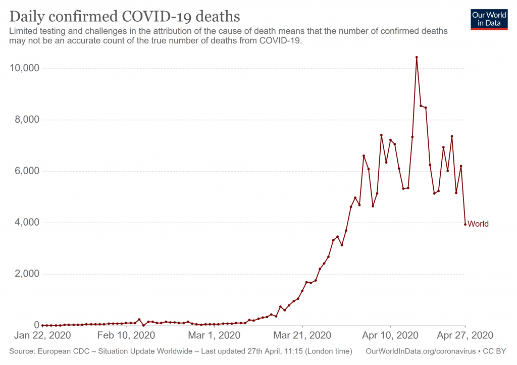
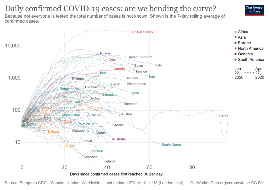
However, we seem to have a prolonged inflexion, giving a linear growth since mid April, i.e. growth and saturation are in rough equipoise, though the very end is beginning to tip over:
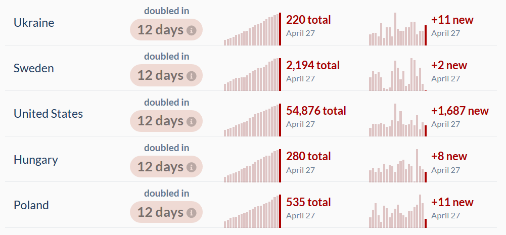
The pattern of doubling time has shifted, with major countries slowing significantly, e.g. here is the USA in immediate context:
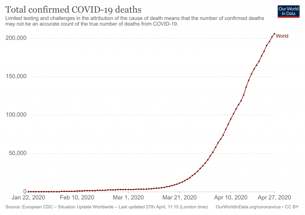
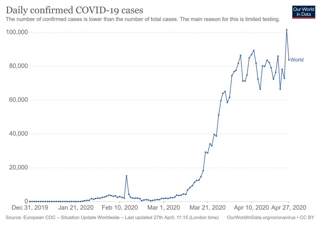
Daily fresh global cases shows the flattened peaking:
National patterns show this too, with China showing secondary etc waves:
It is noteworthy that the UK now views China’s data as questionable:
The British government will no longer recognise the number of coronavirus deaths reported by the Chinese Communist Party (CCP) over fears that the country is producing fake data during the pandemic.
The figures from the communist regime were included in Downing Street’s “global death comparison” until last week as questions began to mount over the accuracy of the strikingly low numbers of deaths in the country from which the virus was spawned.
“This data is used to judge the effectiveness of our own response, whether good or bad. It’s important we are comparing like with like, otherwise our own responses could be distorted leading to more deaths in the UK. Clearly No 10 believes the same as the rest of the world — that China’s data is unreliable and possibly false,” the Conservative Party chairman of the foreign affairs select committee, Tom Tugendhat said according to the Evening Standard.
So, overall, Wave1 is peaking but by no means over. We have to prepare for onward waves. END
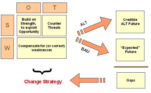
F/N: The SWOT-ALT vs BAU scenario based decision framework for strategic change: