Uncommon Descent Serving The Intelligent Design Community

Pop Quiz for Climatistas

Share
Facebook
Twitter
LinkedIn
Flipboard
Print
Email

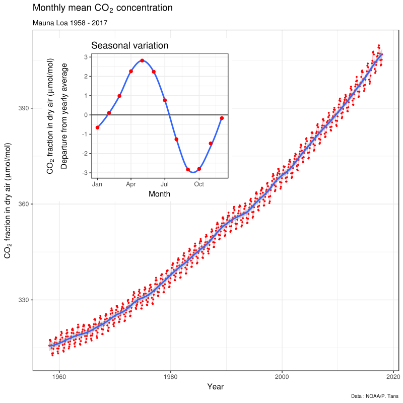
I wonder what you make of this “Keeling Curve.” I especially wonder what you make of the inset–which can be seen to oscillate on the actual graph of this ‘curve’ below the inset.

This might be a very teachable moment.

I await your brilliant responses.

Comments
In related news James Cook University @jcu censures a climate skeptic – help him fight back It looks like one scientist dared to challenge the science behind the alleged demise of the Great Barrier Reef and is now paying a heavy price for that.ET
February 2, 2018
February
02
Feb
2
02
2018
11:43 AM
11
11
43
AM
PDT
"IOW, if you increase the population of plankton by 4%, I don’t see how this increased population size wouldn’t absorb man-made emissions. " CO2 is not a limiting nutrient in the world's oceans. The size of the phytoplankton populations, and therefore the amount of CO2 that they can convert to biomass, is not dependent on the CO2 concentration. It is dependent on nitrogen and/or phosphorus. So, unless you want to increase the amount of raw sewage that we dump into the oceans, which will cause all sorts of other problems, the amount of CO2 that the oceans can process is finite.Molson Bleu
February 2, 2018
February
02
Feb
2
02
2018
10:01 AM
10
10
01
AM
PDT
Molson Bleu: I looked at the link, and the 14C distinction revolves around the "age of the atmosphere," and isn't, as I see it, a reliable way of distinguishing between "fossil fuel" carbon, and natural and man-made sources of 14C. If you invoke the 13C differences, this acknowledges that plants and trees around the world are actually absorbing fossil fuel generated carbon, which was part of my argument regarding the equilibrium equations involved in a sink/source dynamic. My sense in looking around, is that the most important and critical form of photosynthesis takes place ocean-born populations of phytoplankton and zooplankton. The size of these populations has all kinds of things that affect it. So, I can see a scenario in which these populations could easily increase in size. IOW, if you increase the population of plankton by 4%, I don't see how this increased population size wouldn't absorb man-made emissions. So, it's hard to reach conclusions about just what is going on. There are many factors at play, with all of this ending up being quite complex. Our climate models might then, at most, represent our best guess. Should we 'bet' trillions of dollars on this? The corparate giants around the world answer, "yes." Caution is due.PaV
January 31, 2018
January
01
Jan
31
31
2018
10:17 AM
10
10
17
AM
PDT
The question in light of the study posted above @66 on 20% decline. Did Mauna Loa show similar decline during that period?
I too would like to know more about this. The paper is way too technical for me, but the linked phys.org article states:
But the scientists found that between 2002 and 2014, the rate at which CO2 increased in the atmosphere held steady at about 1.9 ppm/year.
Eyeballing the graph in the OP, the blue curve is indeed quite straight between 2002 and 2014 (and is even slightly concave-down), as opposed to its concave-up behavior on average.daveS
January 29, 2018
January
01
Jan
29
29
2018
07:07 AM
7
07
07
AM
PDT
So the Warmers entire case rests on what they can scare you into, when the truth is the relationship between C02 and the weather system is not well-understood, to say the least. Andrewasauber
January 29, 2018
January
01
Jan
29
29
2018
06:20 AM
6
06
20
AM
PDT
Speaking of C02... "No matter what happens, cold, hot, wet, dry, extreme, calm, it’s all controlled by the MagicalMysticalMiracleMolecule. They haven’t moved the goalposts, they’ve installed them along the entire field perimeter." Pay attention Warmers, I'm not the only one who notices these things. Andrewasauber
January 29, 2018
January
01
Jan
29
29
2018
05:40 AM
5
05
40
AM
PDT
The question in light of the study posted above @66 on 20% decline. Did Mauna Loa show similar decline during that period?DATCG
January 29, 2018
January
01
Jan
29
29
2018
05:01 AM
5
05
01
AM
PDT
On CO2 increase in atmosphere. Here's a study showing a decline by 20% thru 2014...
To be clear, human activity continues to emit increasing amounts of carbon, and the atmospheric concentration of CO2, now at 400 parts per million (ppm), continues to rise. But the scientists found that between 2002 and 2014, the rate at which CO2 increased in the atmosphere held steady at about 1.9 ppm/year. In addition, the proportion of the CO2 emitted annually by human activity that remains in the atmosphere declined by about 20 percent. This slowdown can't keep pace with emissions, so the overall amount of human-caused CO2 in the atmosphere increased, just not as quickly. And for that, new research suggests, we can thank plants.
Link... 20% decline thanks to Plants and Global Warming Pause I'm not sure how accurate the statement is on Plants causing a 20% decline. But it's interesting to see that there was a decline. And how plants can benefit. More on plant activity...
The scientists attribute the stalled CO2 growth rate to an uptick in land-based photosynthetic activity, fueled by rising CO2 levels from fossil fuel emissions. It's a snowball effect: as CO2 levels rise in the atmosphere, photosynthetic activity flourishes and plants take in more carbon, sparking more plant growth, more photosynthesis, and more carbon uptake. They also identified another player. Plant respiration, a process in which plants use oxygen and produce CO2, did not increase as quickly as photosynthesis in recent years. This is because plant respiration is sensitive to temperature, and it was affected by the recent slowdown in global warming that was observed most significantly over vegetated land. So, between 2002 and 2014, plants took in more CO2 through photosynthesis, but did not "exhale" more CO2 into the atmosphere through respiration.
DATCG
January 29, 2018
January
01
Jan
29
29
2018
04:56 AM
4
04
56
AM
PDT
I just read rest of Muller's angry comments. I'd missed them. He did not address links on Ocean Acidification or on Great Barrier Reef recovery. But doubled down on angry insults. And claimed they were diversions. The links I posted were not "diversions" but relevant to Ocean Acidification opinions made by him and others. If he disagreed with specifics about Great Barrier Reef Recovery or Ocean Acidification link I provided, he easily could have responded to them.DATCG
January 29, 2018
January
01
Jan
29
29
2018
04:49 AM
4
04
49
AM
PDT
Bob, Thanks for caring. Where did you think I "slandered" someone that I might be banned? ;-) Or did you miss Muller's Gish reference towards me? On the spliceosome, I see you don't wish to comment. But it is a scientific post on the Spliceosome and well discussed. Your contention is there's not enough science post here? Yet you or Seversky and other detractors and opponents of ID who regularly comment here, often do not comment on many science post. Maybe it's not that there's not enough? Maybe you're just not interested in areas of science posted here? What areas of science do you like to participate in and comment on? Besides Climate? Because there are many post here on different areas of evolution, cosmology, etc. Dr. Hunter has posted several recent entries on Evolution's current issues. Did you see them?DATCG
January 29, 2018
January
01
Jan
29
29
2018
03:19 AM
3
03
19
AM
PDT
“I’d be very interested at looking at this kind of information. Do you have any links?” This provides a general overview. In short, the different sources of CO2 (terrestrial, oceanic and fossil fuels) have different ratios. For example, fossil fuels have no C14, terrestrial sources have less C13 than ocean sources. By analyzing the ratios in the atmosphere you can estimate the proportion from each source. And the changes over time. I don’t know if this type of comparison has been made on ice cores, but I would be surprised if it hasn’t. https://www.esrl.noaa.gov/gmd/outreach/isotopes/mixing.htmlMolson Bleu
January 28, 2018
January
01
Jan
28
28
2018
09:00 AM
9
09
00
AM
PDT
Molson Bleu:
Not on a molecule by molecule basis. But carbon isotope ratios can tell them how much of the CO2 is from fossil fuels and how much from terrestrial sources and how much from the oceans.
I'd be very interested at looking at this kind of information. Do you have any links?PaV
January 28, 2018
January
01
Jan
28
28
2018
08:19 AM
8
08
19
AM
PDT
All of that added CO2 and we are now only about 1.7 degrees F warmer than 1880. Heck it changes more than that day to day.ET
January 28, 2018
January
01
Jan
28
28
2018
07:37 AM
7
07
37
AM
PDT
That's pretty cool, Bob O'H, thanks. Here's a screenshot for anyone who just wants to see the plots. Edit: I hope I didn't make any copy/paste errors. The plots look like I expected, anyway.daveS
January 28, 2018
January
01
Jan
28
28
2018
06:48 AM
6
06
48
AM
PDT
PaV @ 48 -
If you look at the above-mentioned graph, the rate of CO2 growth is rather linear, and steep.
mullers_ratchet @ 49 -
“linear”, you think that graph is linear? That’s funny because in 34 you asked me to explain the “exponential” rise in CO2. The rise is of course exponential, just as we’d expect if the atmospheric rise in CO2 was a consequence of industry.
Actually, it's quicker than exponential - I downloaded the Mauna Loa data and regressed the log of the concentration against time. The residuals still show clear curvature, and then regressing against time and time^2 give a positive quadratic coefficient. If anyone is familiar with R and ants to play, this is my code: # Read in data fileMM <- "ftp://aftp.cmdl.noaa.gov/products/trends/co2/co2_mm_mlo.txt" Data <- read.table(fileMM, header = FALSE, skip=0, na.strings = "-99.99") names(Data) <- c("Year", "Month", "Date", "Average", "Interpolated", "Trend", "days") # Fit models: linear, # log scale (=exponential model), # log with quadratic time mod.lin <- lm(Average ~ Date, data=Data ) mod.log1 <- lm(log(Average) ~ Date, data=Data) mod.log2 <- lm(log(Average) ~ Date + I(Date^2), data=Data) # Plot data and models par(mfrow=c(2,1), mar=c(2,4,2,1), oma=c(2,0,0,0), las=1) plot(Data$Date, Data$Average, type="l", xlab="", ylab=expression(paste(CO[2], " concentration")), main="linear scale") abline(mod.lin, col=2) plot(Data$Date, log(Data$Average), type="l", xlab="", , ylab=expression(paste("log ", CO[2], " concentration")), main="log scale") abline(mod.log1, col=2) lines(Data$Date[!is.na(Data$Average)], mod.log2$fitted.values, col=4) mtext("Year", 1, outer=TRUE) legend(1961, 5.99, c("Exponential", "Supra-exponential"), col=c(1,4), lty=1) (edits to removed tyops etc)Bob O'H
January 28, 2018
January
01
Jan
28
28
2018
02:58 AM
2
02
58
AM
PDT
DATGC - good to see you are still here, and able to defend yourself. I don't want to get into spliceosomes, because that's not my area of expertise.Bob O'H
January 28, 2018
January
01
Jan
28
28
2018
02:30 AM
2
02
30
AM
PDT
Careful with that Sandwich Eugene... Understanding the impact on Climate Change of convenience food: Carbon footprint of sandwiches Stop eating sandwiches at restaurants & fast food joints? Should everyone stop buying coffee at Starbucks now? ;-)DATCG
January 28, 2018
January
01
Jan
28
28
2018
02:02 AM
2
02
02
AM
PDT
lol@ "sliceosome" in #54, correction slice, slice Spliceosome. Either way Bob @ 44, hope you read Gpuccio's OP and join discussion.DATCG
January 28, 2018
January
01
Jan
28
28
2018
01:36 AM
1
01
36
AM
PDT
ET @45, yes IPCC has put it out before, but the hockey stick does begin to magically appear. They had to address climate models missing badly on their predictions and the steep upward pace of temps known as the Hockey Stick appeared by Michael Mann. Other scientist challenged. And remember, adjustments were made to lower past temps. Here is what the IPCC shows ... https://www.ipcc.ch/publications_and_data/ar4/wg1/en/ch6s6-6.html
The ‘hockey stick’ reconstruction of Mann et al. (1999) has been the subject of several critical studies. Soon and Baliunas (2003) challenged the conclusion that the 20th century was the warmest at a hemispheric average scale. They surveyed regionally diverse proxy climate data, noting evidence for relatively warm (or cold), or alternatively dry (or wet) conditions occurring at any time within pre-defined periods assumed to bracket the so-called ‘Medieval Warm Period’ (and ‘Little Ice Age’). Their qualitative approach precluded any quantitative summary of the evidence at precise times, limiting the value of their review as a basis for comparison of the relative magnitude of mean hemispheric 20th-century warmth (Mann and Jones, 2003; Osborn and Briffa, 2006). Box 6.4 provides more information on the ‘Medieval Warm Period’.
Remember, the alarmist were predicting end of world Global Cooling in the 70s, prior to end of the world global warming. I think Climate Models still are not good enough to predict 100 years into the future. They failed to predict the Great Pause and the Models trends were way off, running hot as a result.DATCG
January 28, 2018
January
01
Jan
28
28
2018
01:27 AM
1
01
27
AM
PDT
Bob, #44 No, still here :) Glad you mentioned me in fact. I see you complained about Science not being posted and discussed here enough on another post. But I see Gpuccio showed you a post on the Sliceosome you could join in. I've not yet seen you comment or take part in the discussion. Why not? It has been a good discussion. Scientist Arthur Hunt with expertise in RNA commented on the subject and offered up some points in opposition against Design and Irreducible Complexity. Challenging Gpuccio's OP and raising information about Group II introns and evolution of the Spliceosome. Please join in. Read Gpuccio's OP and post some comments... https://uncommondescent.com/intelligent-design/the-spliceosome-a-molecular-machine-that-defies-any-non-design-explanation/DATCG
January 28, 2018
January
01
Jan
28
28
2018
12:53 AM
12
12
53
AM
PDT
MR, You clicked on link but could not read it? It was used by Dr. Tim Ball. Dr. Ball states in one of his articles... "My prime area of research was climatology, particularly how climate changes over time and the impact of those changes on human history and the human condition." Here is his CV same site link... http://drtimball.com/_files/dr-tim-ball-CV.pdf Should I insult you now? Are you not familiar with these time frames in Climate history? Little Ice Age? Here's Wiki for you... https://en.wikipedia.org/wiki/Little_Ice_Age Midieval Optimum? Before reconstruction of data was warmest period. Wiki again has it, "A 2009 study by Michael E. Mann et al., examining spatial patterns of surface temperatures shown in multi-proxy reconstructions finds that the Medieval Warm Period(Medieval Optimum), shows "warmth that matches or exceeds that of the past decade in some regions, but which falls well below recent levels globally."[4] Michael Mann gave us the infamous hockey stick, along with Hide the Decline. Does not surprise me he finds latest climate to be hotter than the past. The Climate Models have continuously been wrong. They had to massage the data in the past, make it colder so that warming would look greater the last several decades.DATCG
January 28, 2018
January
01
Jan
28
28
2018
12:50 AM
12
12
50
AM
PDT
“When they look under their microscopes, or analyze the atmosphere with their chromatographs, do some CO2 molecules say “man-made” while others say “terrestial”?” Not on a molecule by molecule basis. But carbon isotope ratios can tell them how much of the CO2 is from fossil fuels and how much from terrestrial sources and how much from the oceans.Molson Bleu
January 27, 2018
January
01
Jan
27
27
2018
06:23 PM
6
06
23
PM
PDT
mullers_ratchet: I started out saying this was a "possible" teaching moment. How unfortunate it was that a "curve" that was said to arise from measurements at both Hawaii and Antartica turned out to be mostly from Hawaii due to the government cutting back funding for the South Pole portion of the metering. The example of a sink with inflow and outflow was an example of an equilibrium, and came up because I stated this:
Ask yourself this question: What would happen if all man-made CO2 ceased being made? Wouldn’t you expect atmospheric CO2 levels to fall by 4%? Then, contrariwise, the CO2 levels should only be 4% above the 315 ppm level. So, why are they 405 ppm?
. To assume that a small additional inflow would cause the sink to overflow only follows from the presumption that the outflow cannot become any greater. "On average," a small 4% increase in an equilibrium flow situation would likely not greatly aggrevate the system. You seem not to accept this at all. I can't help you there. I think your presumption is that ALL of human made CO2 is independent of the earth's Carbon Cycle, and, so, causes CO2 levels to continually rise. However, in the paper you link to, they state that "only about 40% of those emissions [anthropogenic CO2] have stayed in the atmosphere." This means that 60% is being absorbed by the earth, and is part of the Carbon Cycle. So, is 60% absorbed? Or 80%? Or 100%? We don't know. In fact, the purpose of that paper is to try and find out why this "only 40% of those emissions" has remained constant over five decades:
Of the current 10 billion tons of carbon (GtC) emitted annually as CO2 into the atmosphere by human activities [Boden et al., 2009; Houghton, 2008], only around 40%[Jones and Cox, 2005] remain in the atmosphere, while the rest is absorbed by the oceans and the land biota to about equal proportions [Bopp et al., 2002]. This airborne fraction of anthropogenic CO2 (AF) is known to have stayed remarkably constant over the past five decades [Jones and Cox, 2005], . . .
Think about this: the fraction of anthropogenic CO2 absorbed via the Carbon Cycle [AF] has remained constant for 50 years! Through all kinds of changes. Do you remember writing this:
The. Oceans. Are. Gaining. CO2.
This is what we are being told. How would they know? When they look under their microscopes, or analyze the atmosphere with their chromatographs, do some CO2 molecules say "man-made" while others say "terrestial"? Maybe the number is simply made up. And maybe that's why it remains constant. Have you considered that? Then there's this: (From the beginning of their paper)
The analysis further shows that the statistical model of a constant airborne fraction agrees best with the available data if emissions from land use change are scaled down to 82% or less of their original estimates. Despite the predictions of coupled climate-carbon cycle models, no trend in the airborne fraction can be found.
We're dealing with "man-made" climate models. The old expression was: "Junk in; junk out." Why all this confidence in educated guesses? Better to look around and see what's there. What do we see? We see CO2 levels continue to rise, while global temperatures seem to have leveled off. We see levels of cold and snow not seen in 35 years. If climate models are correct, then how can this happen when CO2 keeps going up? In our part of the galaxy, there are two huge sources of heat: the sun (fusion), and the earth's core (fission). If you want to explain an increase in heat, that's where I would recommend looking first. There's a recent paper out that finds that the rate of glacier melt in Eastern Greenland is correlated to water temperatures. And, guess what, when they started looking aroun they found 11 vents underneath the melting glaciers, with one of the vents measuring about 7 miles across. Same thing recently happened in Antartica. You're entitled to your opinion; but, my bet is when scientists get around to doing real science, the answer to both rising CO2 levels and rising heat can be pinned principally to the earth's core. [Regretably, you can't respond. I hope I've clarified some things.]PaV
January 27, 2018
January
01
Jan
27
27
2018
05:56 PM
5
05
56
PM
PDT
Carbon isotope ratios in the atmosphere also point to the increase largely coming from fossil fuels.Molson Bleu
January 27, 2018
January
01
Jan
27
27
2018
12:56 PM
12
12
56
PM
PDT
Honestly, why are you like this? You may have the worst ratio of confidence to knowledge I've ever run into.
If you look at the above-mentioned graph, the rate of CO2 growth is rather linear, and steep.
"linear", you think that graph is linear? That's funny because in 34 you asked me to explain the "exponential" rise in CO2. THe rise is of course exponential, just as we'd expect if the atmospheric rise in CO2 was a consequence of industry.
IOW, if the “cause” of excess CO2, and hence CO2 growth in concentration, is industry, then the ‘graph’ should track with the industrial production of CO2 over time. But, of course, it doesn’t
But, in fact, it does. Check out Figure 1 here. The correlation coefficient for human cumulative CO2 emissions v atmospheric CO2 is 0.997! So, let's review the thread. You start with the disparaging title and your own mistake in reading the keeling curve. It soon became apparent that seasonal oscillations were well-understood and your cocky tone and "teaching moment" added up to exactly nothing. You then made a strange mathematical error in claiming a 4% increase in the rate of inflow in a tub (or atmosphere) will lead to a 4% increase in volume. Rather than admitting your error you've just stopped talking about this idea. Next, you came up with some half-remembered bollocks about ocean acidification being a made up excuse of a lack of recent warming despite ever-rising CO2. This betrays your ignorance of ocean acidification, recent temperature records or elementary physics. When you finally produced a 15-year-old press release to substantiate you claim it was talking about how the rise in CO2 was slower than it would be if there was no ocean sink. You then jumped on the Antarctic ice core data, making a great deal of the fact the recent increase in CO2 starts in the 1850s or so. You first described the rate of increase as "exponential", but when you had to weasel your way out of mistake you claimed it was linear. Why you got yourself into that mess I don't know. Perhaps you were unaware of the industrial revolution or that burning coal produces CO2? Whatever the source of your ignorance, it's perfectly obvious that the rapid onset of CO2 accumulation exactly at the time that humans started emitting a lot of CO2 is evidence for the fact humans emitted the extra CO2 that is accumulating in the atmosphere. Most amazingly of all: even after making all of these impressive displays of ignorance you still think you are right and that your cockamamie theory about recent CO2 increases coming from the ocean is viable despite the clear evidence that the oceans are gaining and not losing CO2. What kind of person puts up a track record like the one above and doesnt' even stop to think they might be clueless about this topic? UD Editors: Mullers_ratchet is no longer with us.mullers_ratchet
January 27, 2018
January
01
Jan
27
27
2018
12:36 PM
12
12
36
PM
PDT
mullers_ratchet:
You may have heard of the industrial revolution…
If this is supposed to be your reply to my question posed to you, then it is an ill-considered reply. If you look at the above-mentioned graph, the rate of CO2 growth is rather linear, and steep. Now, if the CO2 produced by industry is the cause of the rise in CO2, then the slope of the graph should directly reflect the amount of CO2 produced by industry. So, then, in terms of today's industrial production of CO2, what was the percentage of CO2 production in the 1850's? Maybe one-twentieth of today, or one-fifth of one percent. And what would it have been in early 1900? Or in 1940 or 1970? IOW, if the "cause" of excess CO2, and hence CO2 growth in concentration, is industry, then the 'graph' should track with the industrial production of CO2 over time. But, of course, it doesn't. So, as I say, you gave an ill-considered response. Try again.PaV
January 27, 2018
January
01
Jan
27
27
2018
09:27 AM
9
09
27
AM
PDT
A possible alternative, albeit lacking pithiness:
red herrings, designed to side-track attention, leading us away to a convenient strawman soaked in ad hominems and ignited to cloud, confuse, polarise and poison the atmosphere.
This has similar meaning, but acknowledges some sensitivity to the late Dr Gish.daveS
January 27, 2018
January
01
Jan
27
27
2018
06:25 AM
6
06
25
AM
PDT
Note to muller- It's only a "gish gallop" if you don't have time to answer/ respond to all of it. And here that does not apply so clearly you are mistaken.ET
January 27, 2018
January
01
Jan
27
27
2018
06:13 AM
6
06
13
AM
PDT
muller @ 40:
Do you know what data was used to reconstruct that temperature? Or where the graph comes from?
IPCC 1990 has a similar graph- it appears climate proxies were used along with actual temperature dataET
January 27, 2018
January
01
Jan
27
27
2018
05:58 AM
5
05
58
AM
PDT
kf -
you have obviously failed to read the linked corrective, and seem to imagine that gratuitously slandering someone now unable to defend himself
That's a shame. Has DATCG been banned?Bob O'H
January 27, 2018
January
01
Jan
27
27
2018
05:23 AM
5
05
23
AM
PDT
1 2 3

Leave a Reply