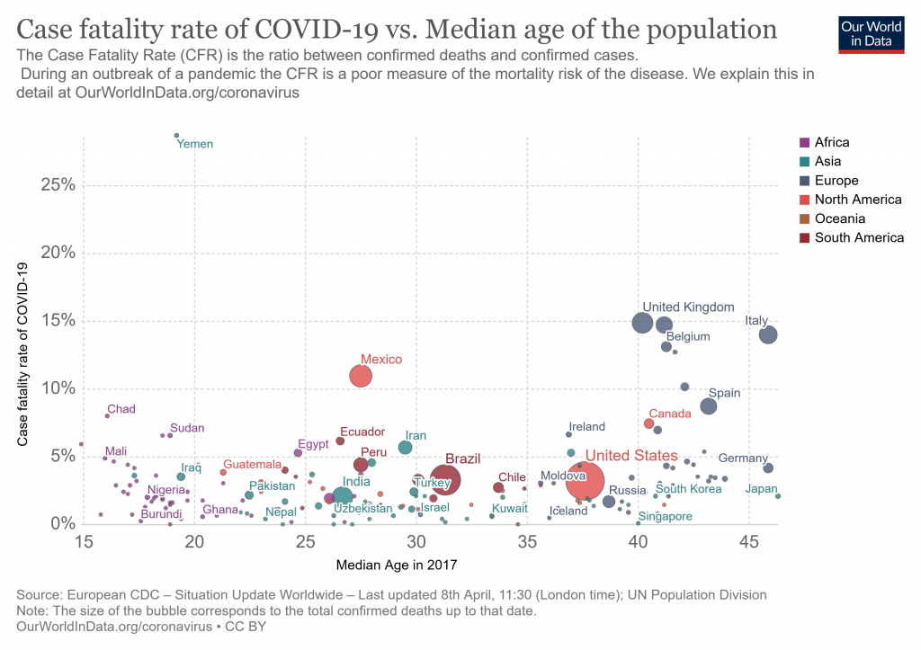
I note, from OWID, today August 13. First, case fatality rate vs population’s median age, though this is oldish data now . . . however exceptionally poor management by the US — an obvious implied thesis — should have been obvious even then:
Next, case fatality rate overall — a metric dependent on degree of testing, how deaths are attributed and tracked:
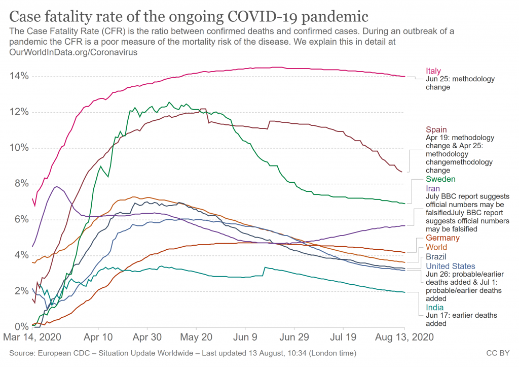
In both of these, the USA — subject of an in thread debate — is unexceptional. In particular, it sits spot on for median age of population. END
PS: Let me add from Worldometers for the USA, noting that deaths also show much the same pattern:
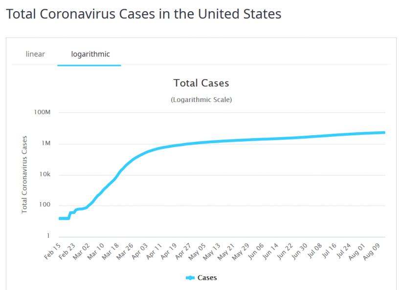
Here, as we went into April, there was a fundamental shift in growth pattern, probably tied to geographic spread beyond initial urban centres. Observe too the subtle kink in June, which ties to a secondary wave.
We may also observe from Worldometers the new cases pattern of a primary wave gradually dying off by April-May then a much bigger secondary one starting early-mid June:
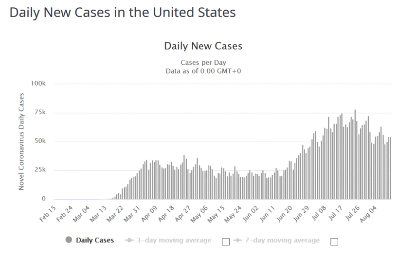
That secondary wave is itself dying off slowly.
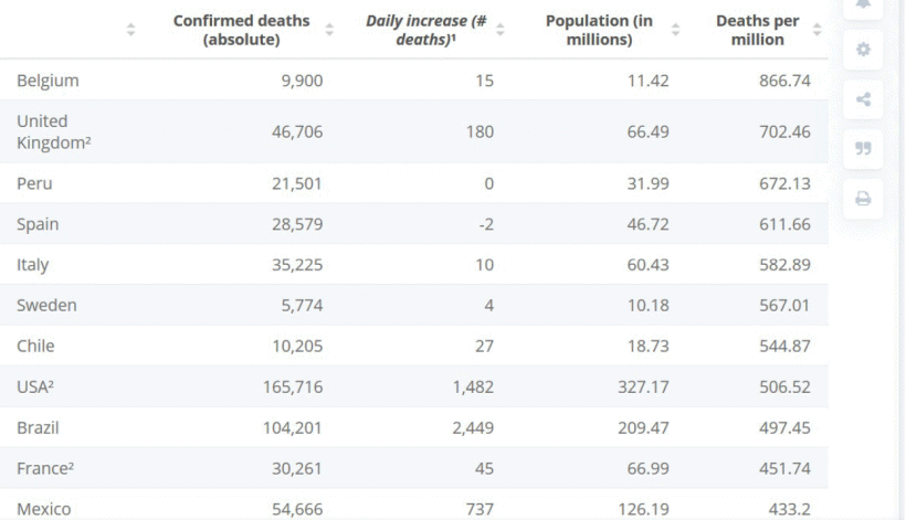
PPS: The ten worst cases on deaths per million, per Statistica: