As we continue to track, let some graphs tell a story, first up is Euro-CDC:
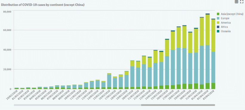
That looks like a peaking, certainly it is not exponential surging in new cases. World in Data, on a 3-day, rolling avg will smoothen, highlighting key countries (including the USA):
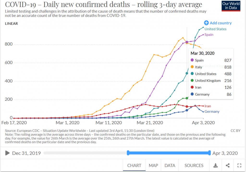
That looks like a flattening, trending to turning over on the driving impulse. Let’s see doubling times, which will track comparable exponential growth:
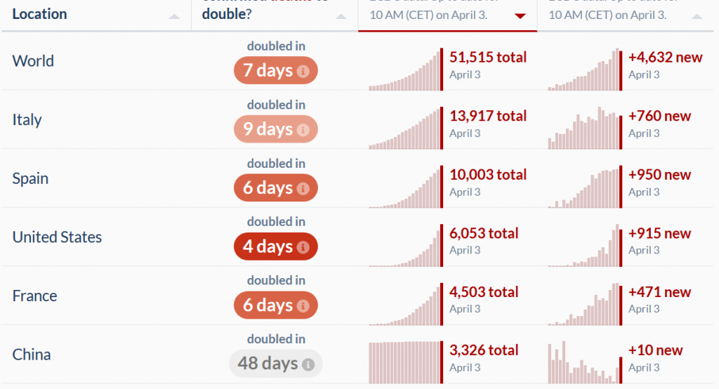
Those were in the 2 – 3 day band previously.
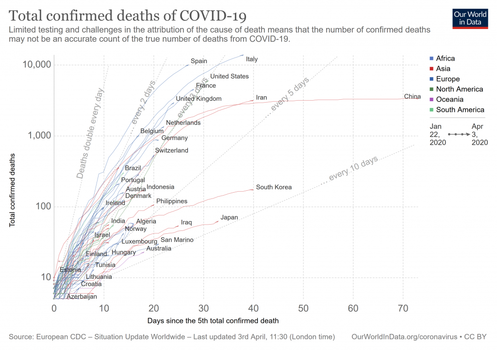
Now, the by country log-lin deaths, with the same 2,3,5 day doubling time rays since five cases as previous:
Likewise, per country log-lin cumulative cases, with the same usual 2,3, 5 and 10 day doubling time from 100 cases rays:
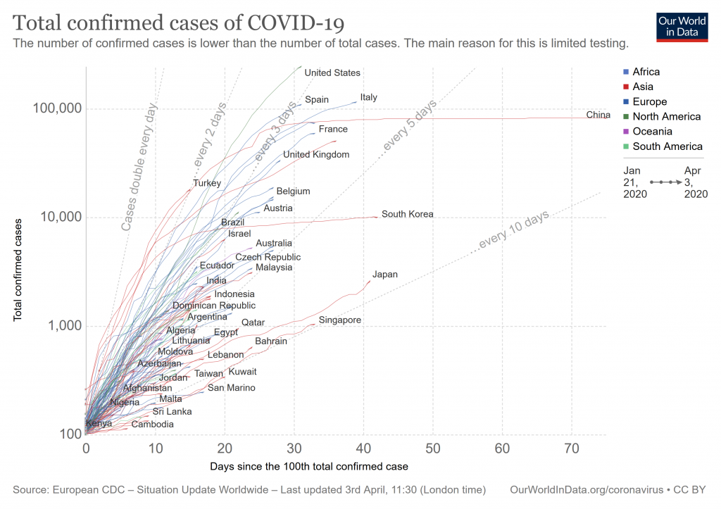
We see a consistent message: while things are bad, we seem to be going peak for at least this wave.
Qualified good news, we are beginning to win this campaign, though we continue to pay a terrible price. Thank God. END